Blog

  • How Great UX Turns Visitors Into Paying Clients

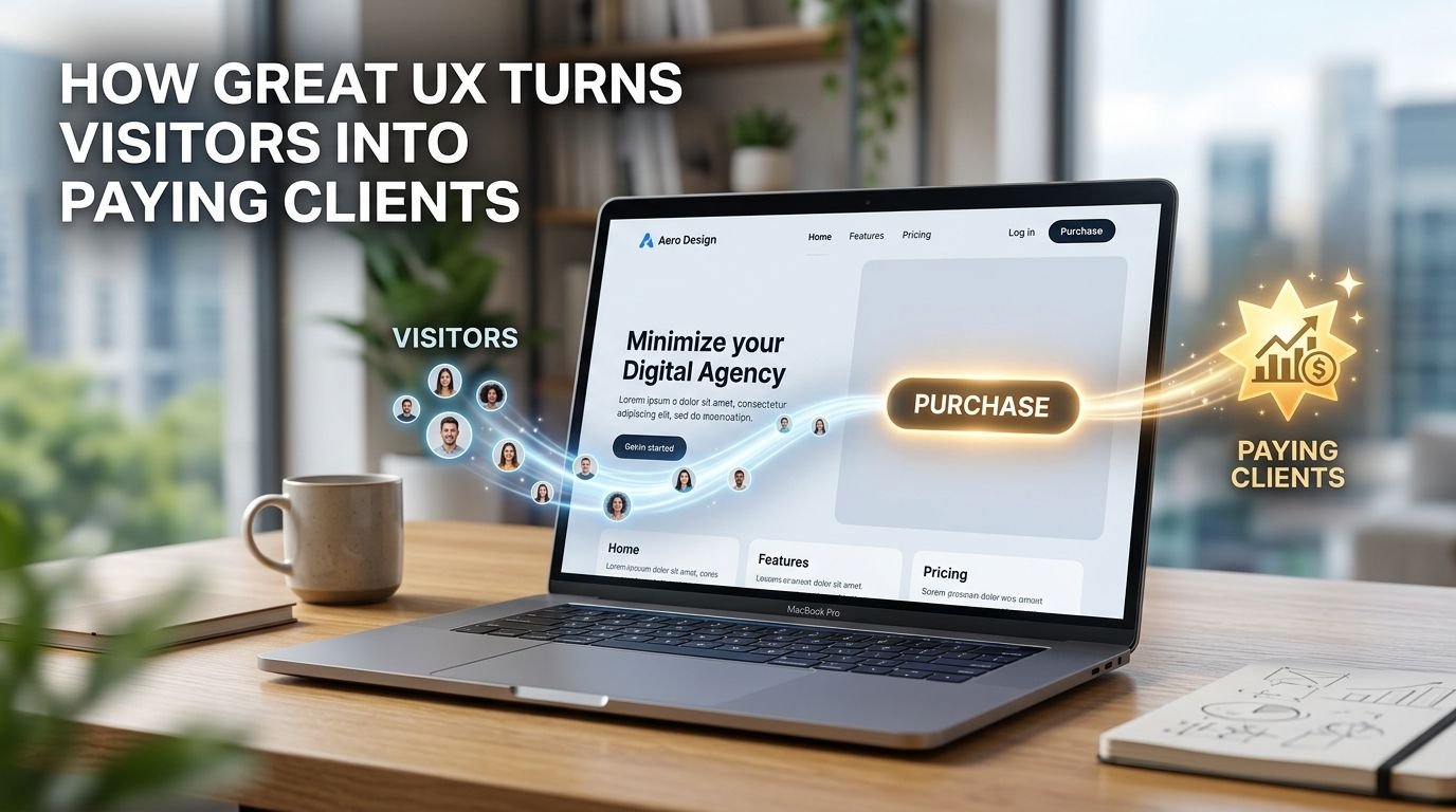
    How Great UX Turns Visitors Into Paying Clients

    The gap between a website that converts and one that quietly leaks visitors often isn’t a redesign-level problem. It usually comes down to a small number of specific UX decisions.

    1. Remove friction from the primary path

    Every extra field on a form, every extra click before someone can see pricing, every moment of “wait, where do I click” is a chance for a visitor to leave instead of convert. Mapping the single most important action on a page – and ruthlessly simplifying the path to it – usually produces a bigger lift than any visual redesign.

    2. Perceived speed matters as much as actual speed

    A page that loads its core content fast – even if some secondary elements are still loading in the background – feels faster than one that makes visitors stare at a blank screen, even if the total load time is technically similar. Perceived performance, not just raw load time, shapes whether someone sticks around.

    3. Put trust signals where the hesitation happens

    Testimonials, clear pricing, and credibility markers work best placed exactly where a visitor is likely to pause – right before a purchase button, right after a price is shown – rather than buried on a separate “About” page they may never visit.

    None of these require a full redesign to test. Auditing a site against these three specifically – friction, perceived speed, and trust-signal placement – is usually where the highest-leverage UX fixes are hiding.
  • 5 Website Mistakes Dubai Businesses Keep Making

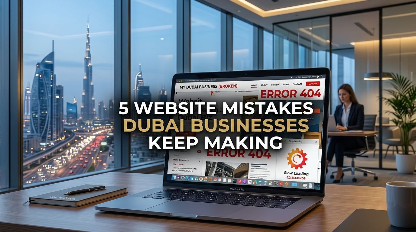
    5 Website Mistakes Dubai Businesses Keep Making

    Dubai’s market moves fast, and a lot of local businesses – even well-funded ones – end up with websites that undersell how good the underlying business actually is. Here are the five mistakes we see most often when auditing sites across the region.

    1. Slow load times on mobile networks

    A large share of traffic in the UAE and wider Gulf region comes through mobile, often on the move. A homepage loaded with uncompressed hero images and auto-playing video can add real seconds to load time – and every extra second measurably increases the chance a visitor leaves before the page even finishes rendering.

    2. No clear next step above the fold

    Beautiful design with no obvious “what do I do now” – no visible call-to-action, no WhatsApp button, no clear way to request a quote – forces visitors to hunt for how to engage. In markets where WhatsApp is often the preferred first contact channel, not surfacing it prominently is a real missed opportunity.

    3. Treating mobile as an afterthought

    Desktop-first design that gets “squeezed” onto mobile instead of designed for it shows up as cramped text, buttons too small to tap accurately, and forms that are painful to fill out on a phone keyboard.

    4. Inconsistent branding across pages

    A polished homepage followed by a services page that looks like it was built by someone else is more common than it should be – usually the result of a site being built in phases with no design system tying it together.

    5. No local context

    Generic stock imagery and copy that could apply to any business in any country misses a real opportunity in a market where showing you understand the local audience – language preferences, cultural context, even the right contact channels – builds trust faster than generic polish alone.

    Most of these aren’t expensive to fix individually. The bigger win comes from fixing them as a system rather than one at a time – which is usually where a proper audit pays for itself.

  • Why Your Logo Is Costing You Clients

    Why Your Logo Is Costing You Clients

    Most business owners think of a logo as a nice-to-have – a small graphic in the corner of a website or the front of a business card. In reality, it’s doing something much bigger: it’s making a trust decision on your behalf before a single word of your pitch gets read.

    People form an opinion about a brand’s credibility almost instantly, often before they’ve read a headline or scrolled past the fold. A logo that looks unfinished, inconsistent, or generic sends a quiet signal: if the branding wasn’t taken seriously, why would the product or service be?

    The five ways a logo quietly repels clients

    It doesn’t scale. A logo that looks fine at business-card size but turns into a blurry smudge as a social avatar or favicon tells visitors the brand hasn’t been built for how people actually encounter it today – across a dozen tiny touchpoints, not one big one.

    It’s inconsistent. A different logo version on the website, the Instagram page, the invoice, and the storefront sign reads as disorganized, even if each individual version looks fine on its own.

    It’s generic. Stock icon plus a sans-serif wordmark is the fastest way to look like every other business that used the same template. Distinctiveness is what makes a brand memorable enough to be referred.

    It has no system behind it. A logo without defined colors, typography, and usage rules gets reinterpreted by every new designer, printer, or intern who touches it – and drifts further from the original intent every time.

    It doesn’t match the price point. A premium service with a bargain-bin logo creates cognitive dissonance. Visitors calibrate their price expectations visually before they ever see a quote.

    None of this means every business needs a six-figure rebrand. It means a logo should be treated as an asset with real commercial weight – one that either compounds trust with every impression, or quietly erodes it.

  • Brand Identity vs. Logo: What’s the Difference and Why It Matters

    Brand Identity vs. Logo: What’s the Difference and Why It Matters

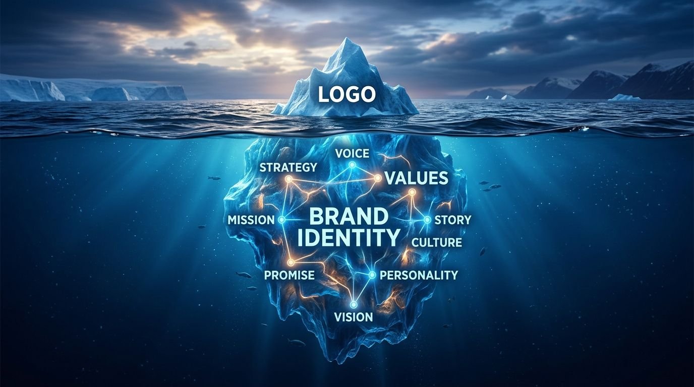
    “Can you design us a logo?” is one of the most common first messages we get – and it’s almost always really a request for something bigger. A logo is one asset. A brand identity is the system that makes that asset, and everything else the business puts out, feel like it belongs to the same company.

    What a logo actually is

    A logo is a single mark – a wordmark, symbol, or combination of the two. It’s the most visible piece of a brand, but on its own it can’t tell your team what color to use on a flyer, what tone to write social captions in, or how much white space to leave around it on a billboard.

    What a brand identity includes

    A full identity system defines the logo and the rules around it: a color palette with clear usage (not just “these five colors,” but which is primary, which is for accents, which is never used as a background), a typography system for headlines versus body text, an image and icon style, and often a short set of brand voice guidelines so marketing copy sounds consistent whether it’s written by the founder or a freelance copywriter six months from now.

    Why the difference matters commercially

    A business that only has a logo tends to look different everywhere it shows up – one font on the website, another on printed flyers, a slightly different shade of the brand color on packaging versus social posts. Individually, none of these feel like a big deal. Together, they quietly tell customers that the business isn’t fully in control of its own presentation.

    A defined identity system fixes this at the source. New team members, freelancers, and print vendors all pull from the same reference instead of guessing, and the brand starts compounding recognition instead of resetting it with every new touchpoint. If your business already has a logo but nothing written down about how to use it, that’s usually a sign the identity work – not another logo redesign – is the actual next step.

  • How Much Should a Website Actually Cost?

    How Much Should a Website Actually Cost?

    “How much for a website?” is a bit like asking “how much for a car?” – the honest answer depends entirely on what’s being built. Here’s what actually drives the number.

    Number and complexity of pages

    A five-page brochure site and a fifty-page e-commerce catalog aren’t the same project, even if both are technically “a website.” More pages usually means more content planning, more design decisions, and more testing.

    Custom functionality

    Booking systems, payment integration, membership logins, multi-language support – each of these is effectively its own mini-project layered on top of the base site, and each adds meaningfully to both cost and timeline.

    Design from scratch vs. template customization

    A fully custom design built around a specific brand identity takes longer than adapting an existing template – but it’s also the difference between a site that looks like everyone else’s and one that’s distinctly yours.

    Content and copywriting

    Who’s writing the actual words on the page? Professional copywriting, photography, and video are often underestimated line items that can shift a budget significantly if they’re not planned for upfront.

    Timeline

    Compressed timelines usually mean more resources working in parallel, which affects cost – while a realistic timeline gives room for proper revisions without rushed decisions.

    As a rough starting point, our own web design work starts from $850 for a fully custom, responsive site – with the final number shaped by the factors above. If you want a number specific to your project rather than a general range, our cost calculator gives an instant estimate based on exactly what you need.

  • Print Isn’t Dead: Why Physical Marketing Still Converts in 2026

    Print Isn’t Dead: Why Physical Marketing Still Converts in 2026

    Every few years, someone declares print marketing dead. Every few years, it quietly proves them wrong – because physical marketing does something digital can’t: it occupies real, tangible space in someone’s hands or their environment.

    Attention is scarce online, abundant offline

    A social post competes with hundreds of others in the same five-minute scroll. A well-designed brochure sitting on someone’s desk, or packaging sitting on a shelf, doesn’t have to fight for attention the same way – it simply exists, undistracted, until it’s picked up.

    Print signals permanence and trust

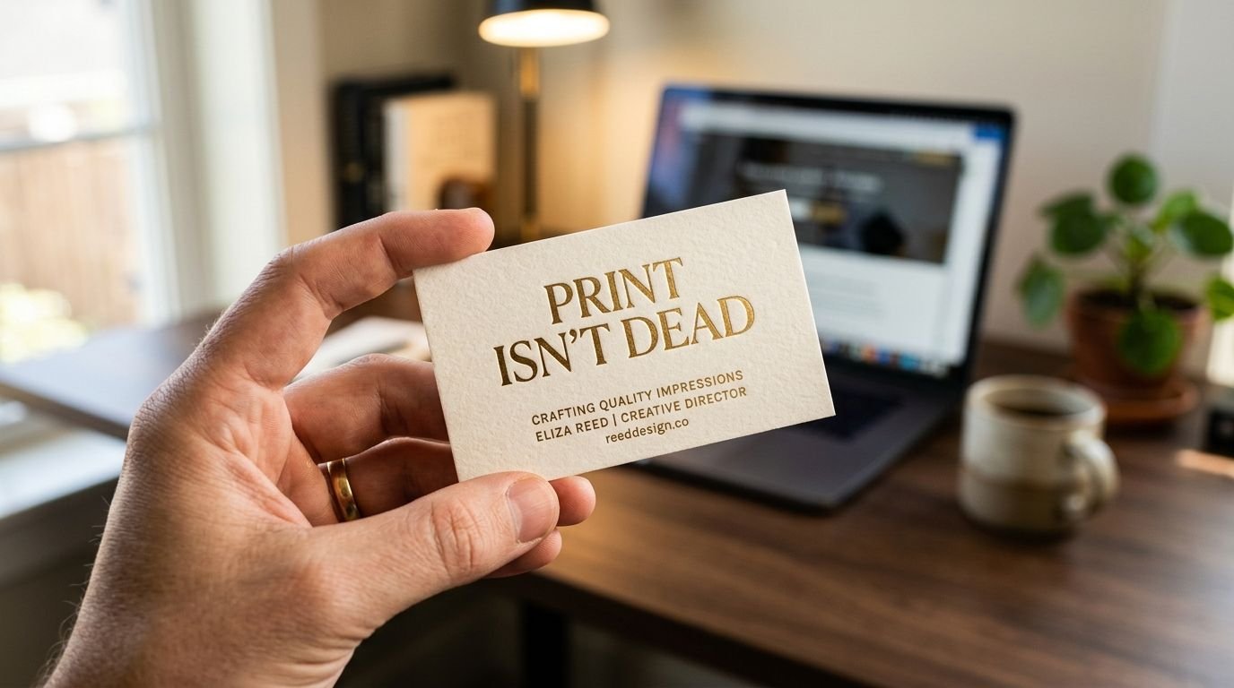
    Business cards, printed signage, and professionally designed packaging still carry a credibility signal that a website alone doesn’t fully replicate – particularly in markets where in-person relationships and trust still drive a large share of business decisions.

    Packaging is marketing, not just protection

    For product businesses, packaging is often the single most-seen brand asset a customer interacts with – more than the website, more than any single ad. Well-designed packaging does double duty: it protects the product and it sells the next purchase.

    Print pairs with digital, it doesn’t compete with it

    A QR code on a flyer, a branded thank-you card in a shipped order, signage that reinforces a social handle – the most effective use of print in 2026 isn’t standalone, it’s the physical half of a strategy that also lives online.

    The businesses getting the most out of print aren’t choosing it instead of digital. They’re using it for what only print can do: sit in a hand, on a shelf, or on a wall – quietly working, with zero algorithm deciding whether it gets seen.

  • The Anatomy of a Thumbnail That Gets Clicked

    The Anatomy of a Thumbnail That Gets Clicked

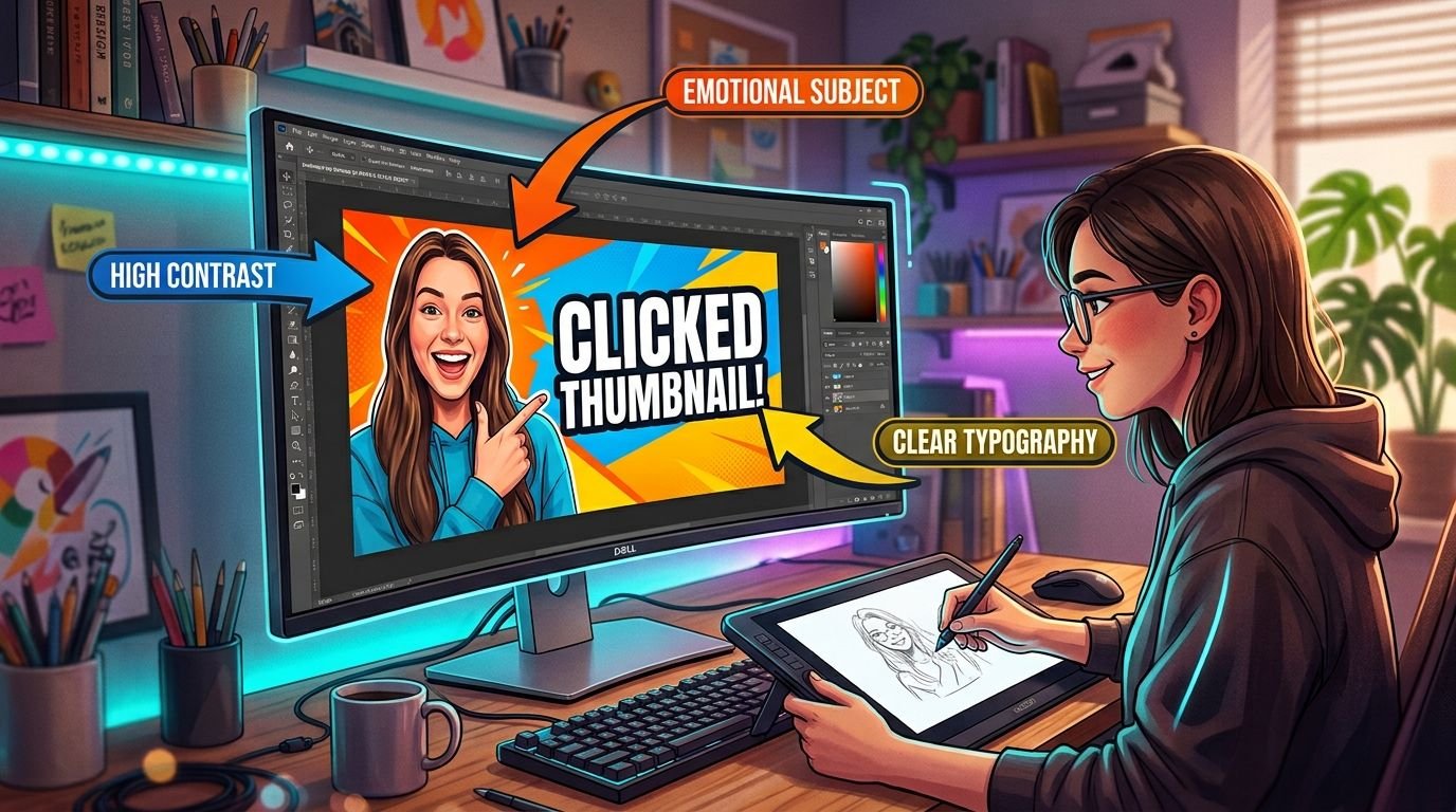
    A thumbnail has one job: earn a click in the half-second someone’s eyes pass over it. That’s a completely different design problem than a logo or a webpage, and it comes with its own rules.

    Contrast first, detail second

    At the size most viewers actually see a thumbnail – often under 200 pixels wide on a phone – fine detail disappears. What survives is silhouette, contrast, and color blocking. If a thumbnail doesn’t read clearly at thumbnail size, it won’t perform any better at full size.

    Faces and emotion do heavy lifting

    Human faces, especially expressive ones, are one of the fastest things the eye locks onto while scrolling. A clear, emotionally readable expression – surprise, excitement, concern – gives a thumbnail an immediate hook that abstract graphics usually can’t match.

    Text: three words, maximum

    Thumbnail text isn’t a caption, it’s a headline fragment. If it needs more than three or four bold words to make sense, it’s competing with the video’s actual title for the same job. Big, high-contrast, and short wins over clever every time.

    Color psychology, used deliberately

    Red and yellow tend to pull the eye fastest, which is exactly why they’re overused – a thumbnail that’s all red in a feed full of red thumbnails stops standing out. Deliberate, brand-consistent color choices that still contrast against a platform’s UI usually outperform “loudest wins.”

    Consistency builds a channel, not just a thumbnail

    A style viewers recognize before they’ve even read the title – consistent framing, a repeated color treatment, a signature layout – builds channel-level trust that a one-off “best” thumbnail never will.

    The best-performing thumbnails aren’t the loudest ones. They’re the ones designed for how they’re actually seen: small, fast, and surrounded by competition.

  • The ROI of Good Design: Justifying a Branding Budget to Stakeholders

    The ROI of Good Design: Justifying a Branding Budget to Stakeholders

    Design is one of the easiest line items to cut when a budget gets tight – mostly because its return isn’t as immediately visible as an ad spend number. Here’s how to make the case in terms a finance-minded stakeholder actually responds to.

    Consistent branding reduces future costs, not just improves aesthetics

    A defined brand identity system means every future asset – a new page, a new campaign, a new hire’s first deliverable – gets built faster because the decisions are already made. Inconsistent branding, by contrast, creates ongoing cost: redesigning collateral, correcting off-brand work, and re-explaining the brand to every new vendor.

    Trust signals shorten sales cycles

    Professional design doesn’t just look better – it reduces the hesitation a prospect feels before committing. A polished, consistent presentation answers unspoken questions about legitimacy and competence before a salesperson even has to.

    Brand recognition compounds

    Every consistent touchpoint – the website, the packaging, the social presence – reinforces the same visual memory. Inconsistent design resets that memory each time, meaning the business effectively pays to rebuild recognition from zero over and over.

    Price positioning follows perceived quality

    Two functionally identical offers priced differently will often sell at different rates purely based on how premium the presentation feels. Good design isn’t just decoration on top of the pricing strategy – it’s part of what makes a higher price believable.

    The pitch to a skeptical stakeholder isn’t “design makes things pretty.” It’s that inconsistent, underinvested branding has an ongoing cost too – it’s just spread out and harder to see on a single line of a budget spreadsheet.

  • Top Design Trends Dominating 2026

    Top Design Trends Dominating 2026

    Design trends move fast, but the ones with staying power tend to reflect a real shift in how people use technology, not just what looks fashionable this quarter. Here’s what’s actually shaping visual culture this year.

    AI-assisted, human-directed workflows

    AI tools are now a standard part of the design process for ideation, mockups, and rapid iteration – but the brands standing out are the ones using AI to move faster to a human-refined result, not to skip human judgment entirely. Fully AI-generated brand work is starting to develop its own recognizable “sameness,” which is quietly becoming a reason to avoid it for anything meant to feel distinctive.

    Dark-mode-first design

    What started as an accessibility and battery-life feature has become a genuine design preference for a large share of users. Brands designing dark-first – rather than bolting a dark mode onto a light-first design – tend to look more intentional and current.

    Bold, oversized typography

    Restrained, safe typography is giving further ground to confident, oversized type treatments used as the primary visual element, not just a supporting one – particularly on landing pages and social content competing for attention.

    Culturally-rooted design over generic global polish

    As more brands operate across multiple markets at once, generic “works everywhere” design is increasingly being replaced by identity systems that deliberately reflect local visual culture – color, pattern, and imagery that feels specific to a place rather than interchangeable with any other market.

    Motion as a brand element, not a decoration

    Subtle, purposeful micro-interactions – how a button responds, how a page transitions – are increasingly treated as part of the brand identity itself, not an afterthought added once the static design is finished.

    The common thread across all of these: intentionality. The brands that stand out in 2026 aren’t chasing every trend at once – they’re picking the ones that genuinely fit their audience and committing to them properly.